
How do I interpret those little line charts in the county profiles?
Have you seen these line charts in the county profiles and wondered what they mean? Wonder no more. Here's what you need to know...
Suppose you select a Wish for less than 24 inches of snow like this:
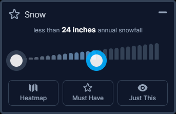
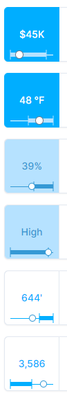
As a result, each county profile will have a small line chart that conveys four important pieces of information.
In our example, (1) the full line width represents the total snowfall range. (2) The thick line represents your limit (0-24 inches) in the entire range. (3) The circle represents the snowfall range for this particular county.

"But wait!" you say. "How can my 24-inch snowfall range cover MOST of the range width if some counties have 183 inches?!" The reason is that the thick line width doesn't represent the number of inches of snow, but rather the ratio of counties that satisfy your requirement. As it turns out, most US counties have less than 24 inches of snow. That's why the thick line covers most of the total range.
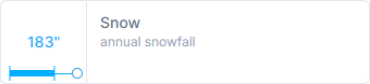
And about that fourth important piece of information... (4) The box color is the last part. In the first case, 183 inches of snow is WAY outside the 24 inch limit you wanted so the box color is white - a poor match.
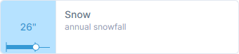
In the second case, 26 inches is nearly within your 24-inch wish, so it's considered a close match, thus the light blue box shading.
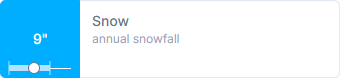
And in the final case, 9 inches of snow is well within your wish limits, so it is dark blue shaded - a 100% match.
Mystery solved! If there is anything else that isn't clear, please feel free to email us at support (at) wheremightilive (dot) com.